Building a Visual Identity for Educational History Channels
So, you want to start a history channel that looks great? Good call. YouTube is packed with historical content now, and if your channel looks like a middle schooler made it, nobody’s going to stick around. People absolutely judge channels by their thumbnails, so you’d better make them count.
Getting Your Channel Branding Right
Before you film anything, figure out what your channel’s going to look like. You need a logo that looks great, colors that work together, and an overall feeling that says, “I know what I’m doing here.” Tons of people start by playing around with an online YouTube thumbnail maker to see what catches their eye and what makes them want to click away immediately.
Most history channels go with earthy, academic colors: browns, golds, deep greens. This makes sense because it gives off that old library vibe. But if you’re doing modern history or want younger viewers, try something different. Just don’t go crazy with neon pink unless you’re covering the eighties.
Your logo doesn’t need to be some masterpiece, but it should be simple enough to read when it’s tiny and professional enough that people take you seriously. Some channels use historical symbols or artifacts; others just go with clean text.
Thumbnails That Get Clicks
Your thumbnail is like a movie poster for a two-minute movie. It’s got to make people curious enough to click while giving them some idea of what they’re getting into. History channels can’t just throw a surprised face on everything and hope for the best.
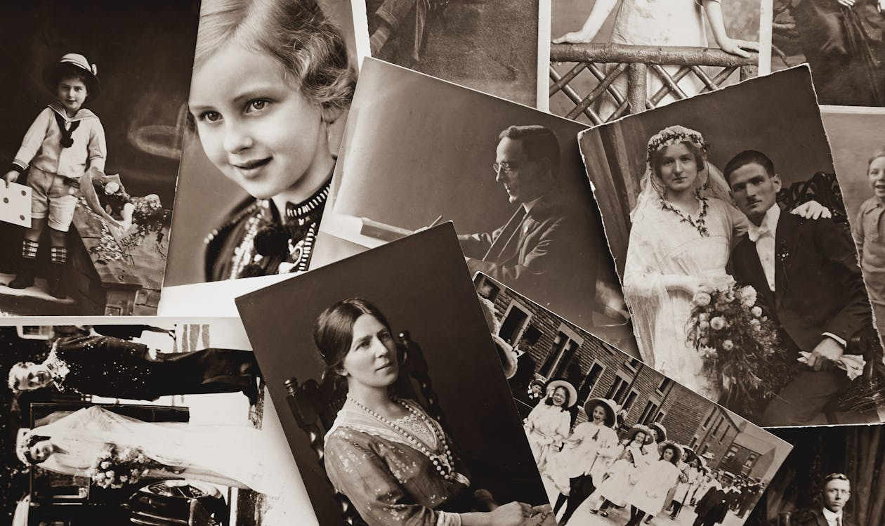
Good history thumbnails usually combine old photos or artwork with text that means something, like a World War II plane with “The Mission That Saved D-Day” or whatever your video covers. The goal is to look interesting without being one of those “You Won’t Believe What Happened Next” channels that everyone hates.
Think about what grabs your attention when you’re scrolling through videos. Something that looks different from everything else, right? That doesn’t mean going wild with colors, but using a consistent style that makes your thumbnails instantly recognizable.
Fonts Matter More Than You Think
You probably never think about fonts until you see someone use Comic Sans for a video about the Holocaust, and then it’s all you can focus on. Pick the wrong font and you’ll look like an amateur even if your research is solid.
Go with something that looks professional but not stuffy. Serif fonts work well for titles because they feel important and historical. For everything else, keep it simple and readable. Remember that most people watch on phones, so if they can’t read your text, they’re clicking away.
Design That Builds Trust
People make snap judgments about whether to trust educational content based on how it looks. Fair or not, that’s just how it works. If your graphics feel thrown together or your text has typos, viewers will start wondering whether your research is any better.
Consistency is what builds trust over time. It’s not just about thumbnails. Your intro, graphics, maps, and end screens should all feel like they came from the same person who knows what they’re doing. Think of it like a visual handshake. Every element should say, “You’re in good hands.”
This is where a lot of history channels lose people. They might have decent thumbnails, but once the video starts, it looks like someone else made it. Fonts change, colors clash, and the maps feel like they were pulled from a completely different decade. That disconnect breaks trust before you’ve even started talking.
Your intro doesn’t need to be fancy, but it should match your overall style. The same goes for your lower thirds when you’re showing names or dates. When everything looks like it belongs together, people start recognizing your content and trusting it more. That kind of recognition becomes incredibly valuable as your channel grows.
Not Boring People to Death
Nobody wants to watch a history video that feels like detention, but you also can’t just throw explosions and memes at everything. It’s this weird spot where you need to seem credible enough that people believe your facts, but interesting enough that they don’t bail halfway through.
Some people go all serious with fancy graphics and that deep documentary voice. Others just sit in front of a camera and talk like they’re telling you about something wild that happened at work. Both totally work, but don’t flip between them, or viewers won’t know what to expect from you.
Your graphics should help explain what you’re talking about, not just be random pretty pictures. For example, if you’re covering some crazy medieval battle, show a map so people can follow along. Or if you’re doing a guide to life in England in the past, use images that show how people lived.
Getting your visual identity right takes forever, and you’ll probably change it three times before you’re happy. But when you nail it, people start recognizing your stuff immediately and trusting that you know your history.